Lecture 3+4+5 - Descriptive statistics;
64
Descriptive statistics serve as device for organization,
summarization of data.
{{Measurements that have not been organized
summarized or otherwise manipulated are called ''raw
data''}}.
Organization and summarization and the displaying of
data
عرض
البيانات
can be done by the following methods.
1) Tabular (Tables):
2) Graphs (figures)
Tables and graphs are often displayed the distributions,
which are useful:
(a) To detect any trends in the data
(b) To detect “unusual” scores in a set of data
(c) To quickly present/summarize a great deal of info
3) Numbers (mathematics)
Single number to summarize the whole data
Note: The purpose of tables and graphs is to present
information in a concise way so that readers can
comprehend
فهم
and remember it more easily.
Tables and Graphs should stand alone in a report.
This means that the reader should not have to refer to the text
in order to understand & interpret the information in them
In practice this means, they require descriptive titles and
clear, meaningful labels.
1) Tabular (Tables):
Table consists of row(S) & column(S), could be 2x2,
2x3….etc.
List is the simplest form of table, consists of two columns
only, the first giving an identification of the observation
unit & the 2
nd
giving the value of the variable of that unit.
Table must be:
a) As simple as possible (it is better to have 2-3 simple
tables than one complicated).
b) Understandable & self-explanatory without references to
the text. This is done by:
The title should be clear (placed above the table), and
answer the questions of: What? Where? And When?
Each row and column should be labeled clearly and
concisely.
Specific unit of the measure for the data should be defined.
Total should be placed.
Illustrate symbols, code, and abbreviation by putting a
footnote below the table.
c) Source of the table (if not original).
d) Avoid too much over ruling.
Tables can display two types of data
1) Categorical
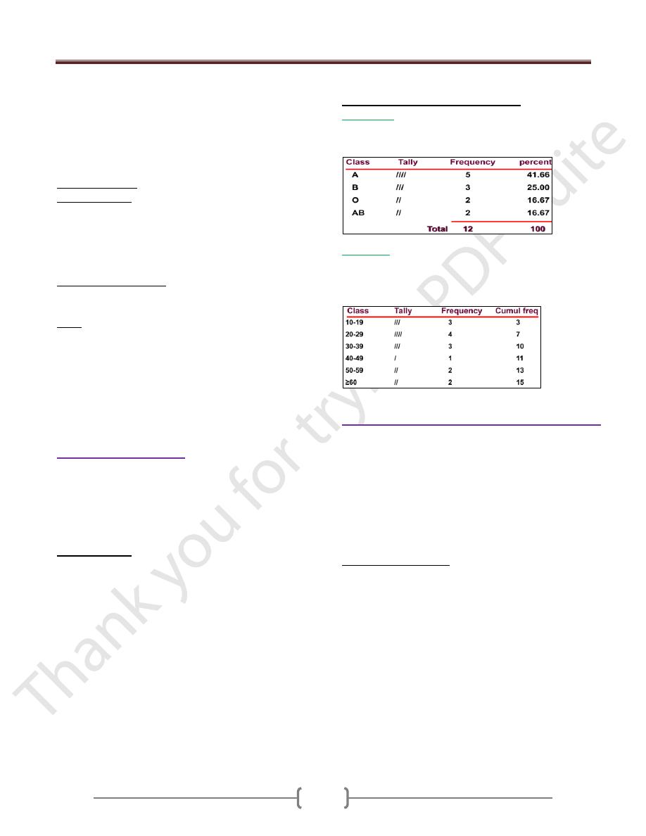
Ex: 12 subjects were tested for blood type: A, B, O, A,
AB, B, O, B, A, A, A, AB
2) Numerical
Ex: The ages of 15 subjects were: 14, 15,16 20,22, 27,
28, 31, 33, 37, 48, 50, 59, 60, 60
Data must be grouped in classes
2) Diagrammatic "Graphical”, “Figure".
Graphs represent pictorial representations of the
distribution of data. Graphs should present a clear and
accurate picture about the data and convey an easy-to-
understand message. Graphs include labels with units of
measurement, a title that accurately describes the contents
of the graph, and a scale on each axes that neither distorts
nor exaggerates the data. Sample size should be included
on the graph or legend.
Graphs versus Tables
• Advantages :
Simplicity, clarity
Easily remembered visual image
Picture of complex relationships
Emphasis
Popular
• Disadvantages:
Lack of precision & Lack of flexibility
Lack of Provide for distortion
Lecture 3+4+5 - Descriptive statistics;
65
The form of the diagram varies according to the
nature of the data:
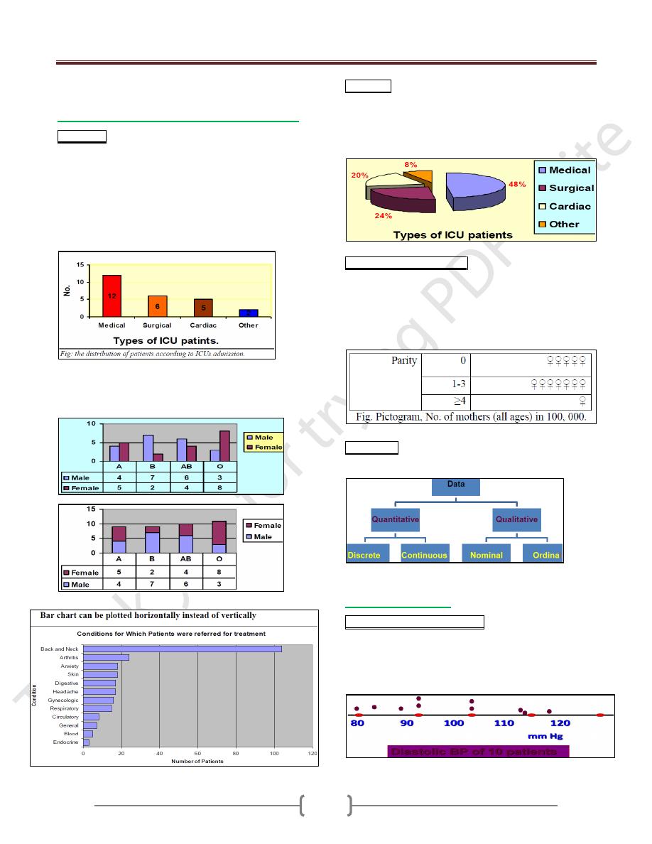
a) For categorical data, we have "chart", this can
Bar chart; This is a graphical representation of the
(relative) frequencies or magnitudes by rectangles of
constant width drawn with length proportional to the
(relative) frequencies or magnitudes concerned, as the
EX. Below:
EX: In certain hospital the number of patients in its 4
ICUs for 1 day was: medical=12, surgical=6, cardiac=5
and other=2. Construct suitable diagram
We have: 1- Clustered bar chart 2- Segmented bar chart
Useful for displaying the distribution of more than one
categorical variable
Pie chart; This is a graphical representation of the
(relative) frequencies or magnitudes by a circle whose
area represent the total frequency and which is divided
into segments which represent the proportional
composition of total frequency, as the EX. Below:
Picto-chart ((Picto-gram)). This is a graphical representation
of the (relative) frequencies by using symbols (drawing or
picture) relevant to the subject matter. Symbols of different
size should not be used. A unit value of the data should be
represented by standard symbol which may repeat to represent
magnitude. As in the Ex.
Flow chart. Flow-chart. The sequence of series of events
is often illustrated by flow chart, as in the Ex.
b) For numerical data
One dimensional dot diagram. This is a diagrammatic
representation of the distribution of a variable in which
every observation is marked as a dot corresponding to its
value on a line (usually horizontal line) calibrated within
the range of values of the variable. As in the Ex.
Lecture 3+4+5 - Descriptive statistics;
66
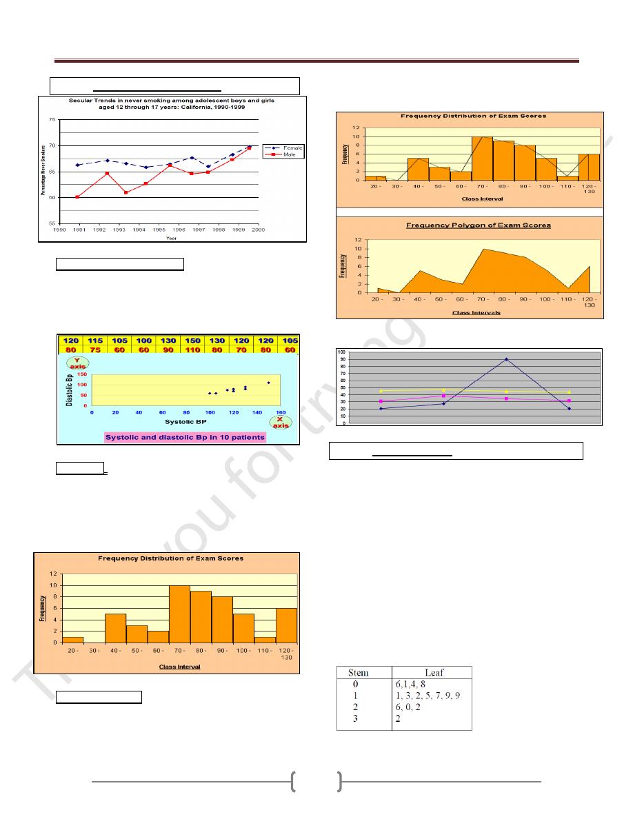
Arithmetic Scale Line Graph
Scattered diagram (dot-graph). Each observation is
marked as a dote corresponding to its value on each axis
(X & Y). The pattern made by the dotes is an indication
of relation between the two axes, which may be linear if
the follow a straight line or curved if not.
Histogram: This is a graphical representation of
frequency distribution in which rectangle proportional in
the area to the frequencies are erected on the horizontal
axis. The base lines are continuous (because we are
dealing with continues variables). The width of the
rectangles should be equal. As in the Ex.
Frequency polygon: If we join the tops of the rectangles
in the histogram→Polygon (total area of histogram= total
area of polygon). It is only appropriate when the variables
on the horizontal axis are continues and there is only
single value on the vertical axis. As in the Ex.
Advantage: can present more than one set of data.
Stem & Leaf plots
It is the combination of a graphic technique and a sorting
technique of the data
The raw data can still be obtained from the graph for
further analysis
The stem is the leading digit(s) of the data
The leaf is the trailing digit(s) of the data
Ex1: A pediatric registrar is investigating the amount of
lead in the urine of children from a nearby housing estate.
In a particular street there are 15 children whose ages
range from 1 year to under 16, and in a preliminary study
the registrar has found the following amounts of urinary
lead (nmol/24 hrs): 0.6, 2.6, 0.1, 1.1, 0.4, 2.0, 0.8, 1.3,
1.2, 1.5, 3.2, 1.7, 1.9, 1.9, 2.2
Lecture 3+4+5 - Descriptive statistics;
67
Stem and leaf "as they come"
Ordered stem and leaf plot
EX2: systolic blood pressures of 30 subjects are 185, 160,
235, 165, 125, 175, 185, 132, 168, 112, 170, 155, 105,
158, 120, 190, 140, 185, 125, 180, 145, 110, 155 135,
170, 113, 155, 175, 145, 130
Arrange the data from least to greatest: 105, 110, 112,
113, 120, 125, 125, 130, 132, 135, 140, 145, 145, 155,
155, 155, 158, 160, 165, 168, 170, 170, 175, 175, 180,
185, 185, 185, 190, 235.
Stem/leaf Stem/leaf
10 | 5 18 | 0555
11 | 023 19 | 0
12 | 055 20 |
13 | 025 21 |
14 | 055 22 |
15 | 5558 23 | 5
16 | 058
17 | 0055
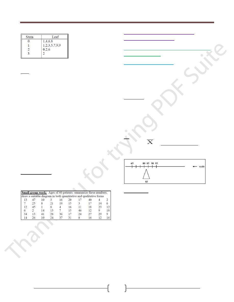
Small group work: Ages of 60 patients: summarize
these numbers, draw a suitable diagram in both
quantitative and qualitative forms
3) Mathematical ((Numerical))
representation of data
1- Measurements of location ((Measurement of
central tendency)).
a) Arithmetic Mean (Average)
The most commonly used measure of central tendency.
This is the sum (Σ) of all observations divided by the
number of observation. We have:
Population Mean (µ) = Σx / N (N= No. of population)
Sample Mean (x) = Σx /n (n= No. of sample)
Advantages.
Uniqueness, only Arithmetic Mean for a giving set of
data.
Simplicity, easy to compute & understand.
Take in consideration all values, not ignore any one (takes
into account the magnitude of each and every observation
in the data).
EX: Suppose data are: 90, 80, 95, 85, and 65 (n=5)
Sample mean
= 90 + 80 + 95 + 85 + 65 = 83
5
The mean can be thought of as a “balancing point”,
“center of gravity”
Disadvantages.
Affected by the extreme values, which in some cases so
distorted that it become undesirable as a measure of
central tendency. As an EX. Of how the extreme values
may affect the mean: Suppose five physicians receive the
following charges, $95, $95, $85, and $280. The charge
for the five physicians is found to be $118, a value that is
not very representative to their charges.
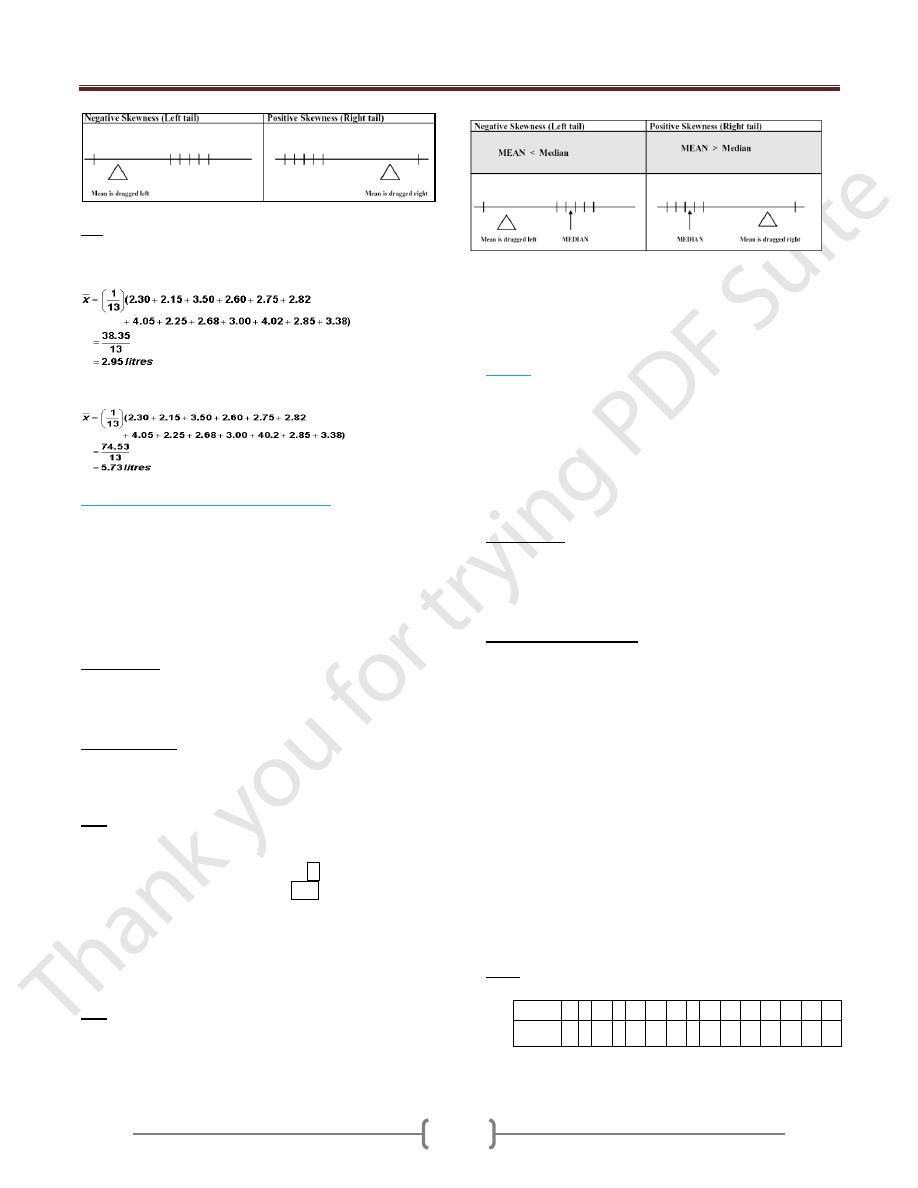
The mean is the most commonly used measure of central
tendency. However, if the data has extreme values (very
high or very low values produce skewness in the data),
such values can pull the mean towards one side and make
it less usefull. The median is less influenced by extreme
values and this makes it useful in certain epidemiological
studies where skewed distributions are studied.
Lecture 3+4+5 - Descriptive statistics;
68
Ex: Measurement results from the Forced Expiratory
Volume (FEV) test in one second (in litres): 2.30, 2.15,
3.50, 3.60, 3.50, 2.82, 4.05, 2.25, 2.68, 3.00, 2.68, 2.85,
3.38. The mean is calculated as:
If the 11th observation was accidentally recorded 40.2
liters, and not 4.02 then our calculation would be thus:-
b) Median (50
th
percentile, 5
th
deciles).
It is the value that divides the data into two equal parts
(50% greater and 50% lesser than it)) giving that the
values are arranged in o ordered of magnitude.
If the number of values is odd, then the position of the
median = n+1/ 2.
If the number of values is even, then the median is taken
to be the mean of (n/2) and (n/2 +1) observations.
Advantages.
1) Uniqueness, only 1 median for a giving data.
2) Simplicity, easy to calculate.
3) Not affected by the extreme values.
Disadvantages.
Didn't take in consideration all values, but only the
median one.
EX: give the median of these values:
1
st
set of data: 5, 15, -7, 20, 25, 3, -1, 0 & -3.
2
nd
set of data: 7, 9, 16, -5, -9, 3, -4, & 6.
Solution: ordered array: -7, -3, -1, 0, 3, 5, 15, 20, 25
-9, -5, -4, 3, 6, 7, 9, 16
Median position= (9+1)/2=5, i.e. the 5th reading,
median = 3 in 1st set = 8/2 = 4 & (8/2) + 1 = 5 so
position 3 & 6, (3+6)/2= 4.5 in 2nd set
The Median is a Better Description (than the Mean) of the
Majority When the distribution is skewed (not affected by
the extreme values).
Ex: Data are: 14, 89, 93, 95, 96
• Skewness is reflected in the outlying low value of 14
• The sample mean is 77.4
• The median is 93
When do we use mean & median?
If there are extreme values in a set of data we use the
median, so as not to be misled by extreme value when we
use the mean.
c) Mode.
The value which occurs most frequently. Mode is not
unique
If all values are different → No mode.
If one value which occur most frequently → Uni-modal.
If two values which occur most frequently → Bi-modal.
If 3 values which occur most frequently → Tri-
modal….etc.
Advantages.
1) Simplicity, easy to calculate.
2) Unlike mean & median, the mode can be used for qualitative
data (e.g., modal diagnosis as HT, DM, IHD …..etc.).
Important to know:
If the data is homogenous, we use the mean, but if it is
not, we use the median.
For uni-modal frequency distribution (normal
distribution) which is symmetric: The mean = The median
= The mode.
Knowing the values of the mean and median of a
distribution can provide some information on the
skewness of a distribution.
If the mean is greater than the median then: the
distribution is positively skewed; the long tail is on the
high (usually right) side of the graph.
If the mean is equal to the median then: the distribution is
symmetric.
If the mean is less than the median then: the distribution is
negatively skewed; the long tail is on the low (usually
left) side of the graph.
Ex 1: A sample of 15 patients making initial visit to a
clinic, travailing these distances:
Patient
1
2 3
4 5
6
7
8 9
10
11
12
13
14
15
Distant
(x)/Km
5
9 11
3 12
13
12
6 13
7
3
15
12
15
5
Lecture 3+4+5 - Descriptive statistics;
69
Mean(x) of the distance =
X /n = (5+9+11…. +5)/ 15
= 9.4 Km.
Median of the distance: As the number of values is odd,
the position of the median will be (n+1)/2 after arranging
the values in ordered array → (3, 3, 5, 5, 6, 7, 9, 11, 12,
12, 12, 13, 13, 15, 1w5). So the median is 11.
Mode = 12
Ex 2: The following are the WT of a sample of 10
experimental animals.
Mean(x) of the WT =
x /n = (13.2+15.4+13.0…
+13.1)/ 10 =14.58 Kg.
Median of the WT: As the number of values is even,
the median will be mean of (n/2) and (n/2+1) values
after arranging the values in ordered array→ (13, 13.1,
13.2, 13.6, 14.4, 14.6, 15.4, 15.4, 16.6, 16.9). So the
median will be the mean of No. 5 &6 values =14.4 +
14.6/ 2 = 14.5 Kg.
Since all the values with same frequency → No mode.
2. Measurements of dispersion (scattering,
spreading, variation).
This is the variety that the values exhibit about their
mean. If all values are the same →No dispersion. If all
values are close together → Small dispersion. If the
values are widely scattered → Great dispersion.
a) Range (R):
Is the difference between the largest (X
L
) and smallest
(X
s
) values in a set of observation. → R = X
L
- X
s
.
It’s the least commonly used measure because of the
following disadvantages:
a) Didn’t take in consideration all the values, only the
extremes.
b) Not stable estimate because as the sample size
increases, the range will increase too.
The only advantage is simplicity.
b)
Variance:
This is the dispersion relative to the scatter of the values
about their mean. We have;
a- Population variance (
2
b- Sample variance (S
2
).
S
2
= n
x
2
-(
x)
2
\ n(n-1).
Disadvantages. Since it represents squared unit, therefore
it's not appropriate measure of dispersion when we wish
to express this concept in term of the original units.
c)
Standard deviation(S).
It's the square root of the variance; it provides a summary
of dispersion of individual observations around the mean.
It’s the most frequently value used in dispersion.
S =
S
2
Note. We have what we called the standard error (SE),
which is not a mistake but it gives the standard difference
of sample mean from population mean. SE = S\
n. →
As the sample size increases, the SE decrease, and if we
use all the population, there is no SE.
Ex 1: A sample of 15 patients making initial visit to a
clinic, travailing these distances:
x = 141
x
2
= 1515
-Range = 15- 3 = 12 Km.
- Variance (S
2
) = n
x
2
-(
x)
2
\ n(n-1).
= 15 (1515)-(141)
2
\ 15(14) = 17.8 Km
2
.
-Standard deviation(S) =
S
2
= ± 4.2 Km.
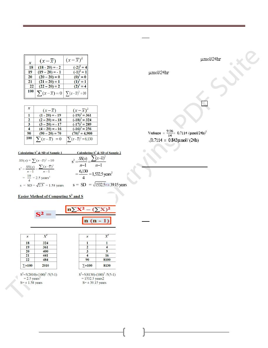
Measurements of dispersion (scattering, spreading,
variation)
Knowing the mean is not enough
A key issue is how alike or “unlike” each other the
individual observations are
Ex: 2
samples with same mean, but…
To understand the variation in the sample we should
calculate the standard deviation which is a summary
measure of the differences of each observation from the
mean (SS). If the differences themselves were added up,
No.
1
2
3
4
5
6
7
8
9
10
WT
(Kg)
13.2
15.4
13.0
16.6
16.9
14.4
13.6
15.0
14.6
13.1
Patient 1
2
3
4 5
6
7
8
9
10
11
12
13
14
15
Distant
(x)/Km
5
9
11
3 12
13
12
6
13
7
3
15
12
15
5
(x)
2
25 81 121 9 144 169 144 36
169 49
9
225 144
225 25
Lecture 3+4+5 - Descriptive statistics;
70
the positive would exactly balance the negative and so
their sum would be zero.
Calculating SS(x)
for Sample 1
Calculating SS(x)
for Sample 2
Variance and SD are the most common measures of
variation, but some time we use range=Max-Min, but this
measure is unstable and lessuseful.
EX: Urinary concentrations of lead in 15 children were:
0.6, 2.6, 0.1, 1.1, 0.4, 2.0, 0.8, 1.3, 1.2, 1.5, 3.2, 1.7, 1.9,
1.9, and 2.2. Calculate the measures of central tendency
and dispersion
The total of the values is 22.5
, which was
divided by their number, 15, to give a mean of 1.5
.
To find the median (or midpoint) we need to identify
the point which has the property that half the data are
greater than it, and half the data are less than it after
data ordering.
0.1, 0.4, 0.6, 0.8, 1.1, 1.2, 1.3, 1.5, 1.7, 1.9, 1.9, 2.0,
2.2, 2,5, 3.2
Median position=15+1/2=8 the median is 1.5
The mode is 1.9
S
2
=15(43.71) – (22.5)
2
/15(15-1) S=√S
2
Coefficient of Variation (CV)
Useful measure of relative spread of data and is used
frequently in biological sciences.
It produces a measure of relative variation, (variation that
is relative to the size of the mean), rather than actual
variation.
useful for comparing two or more data with different units
of measurement because it is expressed in percentage
CV = SD/mean x 100%
Ex: Suppose we have 2 samples of males
n1 age 25 years, mean Wt=145 lb, S=10
n2 age 11 years, mean Wt=80 lb, S=10
Which group is more variable?
A comparison for SD might lead one to conclude that the
2 samples possess equal variability. But calculation of CV
CV for group 1= (10/145) X 100 = 6.9
CV for group2= (10/80) X 100 = 12.5
Different Impression
Lecture 3+4+5 - Descriptive statistics;
71
Group Discussion
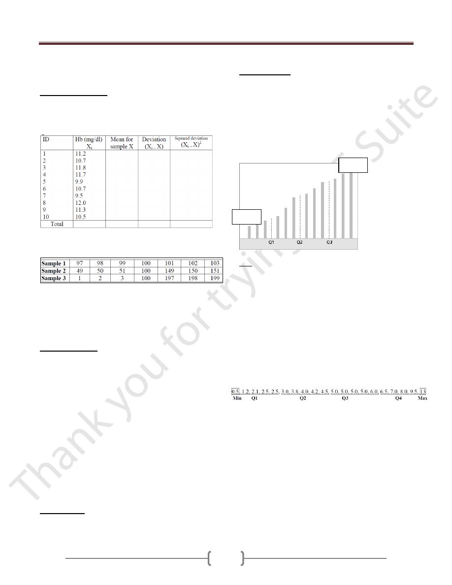
1) The Hb level in 10 patients is shown in table below.
Complete the data required and calculate the measures of
location and dispersion. Draw suitable diagram
2) Suppose we had the following data from 3 different
samples.
The average for each sample is 100. Also, the median for
each sample is 100. But it is obvious that each sample is
quite different, despite having the same mean and median.
How can we prove that?
Percentiles (P):
The value below which a given
percentage of the cases fall. The value of the k
th
percentile
is obtained by ranking the observations and looking at the
value of the {(k/ n) X100}th observation.
EX1: A teacher gives a 20 point test to 10 students. The
score are: 18, 15, 12, 6, 8, 2, 3, 5, 20, and 10. Find the
percentile of score 12.
Sol: Arrange the data in order from lowest to highest: 2,
3, 5, 6, 8, 10, 12, 15, 18, and 20.
(k/ n) X100= (7/10)X100 = 70% thus the student whose
score 12 did better than 70% of the class.
EX2: Find the value that corresponds to 60
th
percentile.
(60 X 10)/100=6 (position of 60
th
percentile), hence 10
score. Thus any one scoring 10 would have done better
than 60% of the class.
Deciles (P):
position in tenths a data value in the
distribution → (k/ n) X10
Quartile (Q);
position in fourths a data value in the
distribution → (k/ n) X4
The first quartile (Q1) is the value of the {(n + 1)÷4}th
observation.
The third quartile (Q3) is the value of the {3x(n +
1)÷4}th observation.
Interquartile range (IQR): The middle half of the
values. i.e. those lying between the first and third
quartiles(Q1- Q3).
Ex: The following are the diameters (in cm) of pure
sarcomas removed from the breast of 20 women: 0.5, 1.2,
2.1, 2.5, 2.5, 3.0, 3.8, 4.0, 4.2, 4.5, 5.0, 5.0, 5.0, 5.0, 6.0,
6.5, 7.0, 8.0, 9.5, and 13. Calculate Q1, Q2 (median), Q3,
and IQR.
Q1= (20+1)/4 = 5.25
th
measurement. Either we say
Q1 is 5
th
measurement = 2.5 or
Q1= 2.5 + 0.25(3.0 - 2.5)
= 2.625
Q2 (median) = 2(20+1)/4 = 10.5
th
value
= 4.5 + 0.5(5.0 - 4.5) = 4.75
Q3 = 3(20+1)/4= 15.75
th
value. Either we say Q1 is 15
th
measurement = 6 or
= 6.0 + 0.75(6.5 - 6.0)= 6.375
IQR= Q3-Q1 = 6.375 – 2.625 = 3.75
Min
Max