~1
~
Third Stage Community Medicine Dr.Alaa
Medical Statistics -
Lectures Three
The Graphical Representation of Data
Types of graphs:
Bar chart: It a graphic representation used to present data of qualitative type.
It is composed of number of bars separated from each other, the width of the bar is not of
that importance but it is preferable to be of the same width (so as to give true impression),
the length of the bar is of importance and it is drawn proportional to the frequency or
percentage.
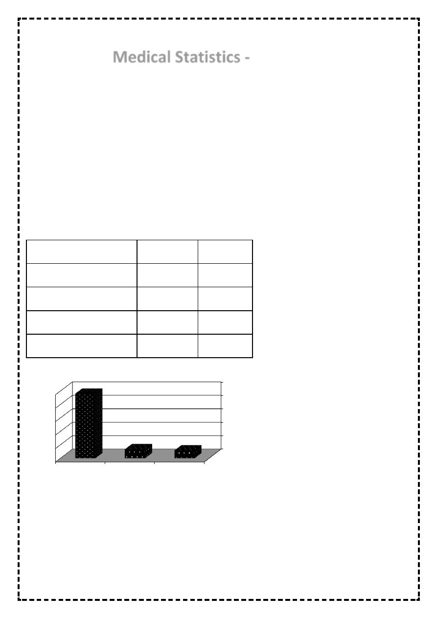
Table 4: The method of delivery of 600 babies born in Bintul Huda Teaching Hospital for the year
2010
Method of delivery
No. of births
Percentage
Normal vaginal delivery
478
79.7 %
Forceps delivery
65
10.8 %
Caesarean section
57
9.5 %
Total
600
100 %
Figure 1: The method of delivery of 600 babies born in Bintul Huda Teaching Hospital for the year 2010
0
100
200
300
400
500
Caesarean
section
Forceps
delivery
Normal vaginal
delivery
57
65
478
~2
~
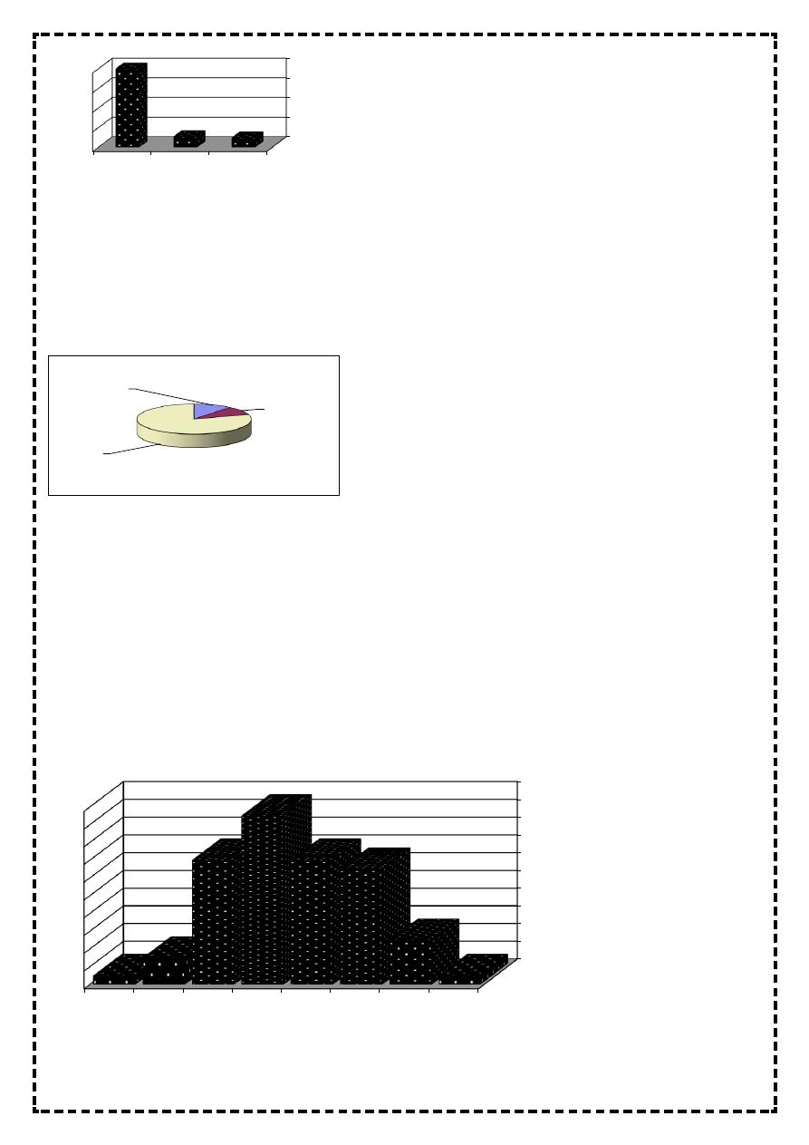
Figure 2: The method of delivery of 600 babies born in Bintul Huda Teaching Hospital for the year 2010
Pie chart:
It is a graphic representation used to present data of qualitative type in shape of circle
The size of the slice for each category is determined by the equation f/ n * 3600.
Figure 3: The method of delivery of 600 babies born in Bintul Huda Teaching Hospital for the year 2010
Histogram:
It is a graphic representation used to present continuous quantitative data arranged in class-
interval
It is composed of number of bars adherent to each other
The width of bars is very important which equal to the width of class interval, and the length
of the bars is proportional to the frequency of class interval or its percentage
So the area in histogram is very important and it represent 1 unit, 100% equal to the
probability
Figure 4: The haemoglobin level in g/ dL for 70 pregnant women in Bintul Huda Teaching Hospital for the year 2010
0.00%
20.00%
40.00%
60.00%
80.00%
Caesarean
section
Forceps
delivery
Normal
vaginal
delivery
9.50%
10.80%
79.70%
Forceps
delivery
10.8%
Caesar
ean
section
9.5%
Normal
vaginal
delivery
79.7%
0
2
4
6
8
10
12
14
16
18
20
15
-
15.9
14
-
13
-
12
-
11
-
10
-
9
-
8
-
1
5
13
14
19
14
3
1
~3
~
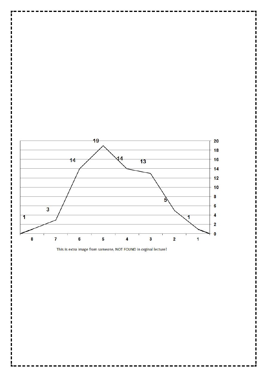
Line graph (frequency polygon):
It is a graphic representation used to present discrete quantitative data, also it can be
derived from histogram (that is used to present continuous quantitative data arrange in
class-interval) by taking the mid point at the top of each bar, joining them by straight lines
The line graph should not be left open, it should be closed by taking the mid point of the
class-interval before the first class-interval (it has a frequency of zero) and taking the mid
point of the class-interval after the last class-interval (it has a frequency of zero)
So the line graph will join the X-axis at these two ends.
The area of line graph below the line above the X-axis is equal to the area of histogram,
equal to one unit, equal to 100%, equal to the probability.
Also line graph is used when we want to present two groups by one graph for the purpose
of comparison, which is not possible by histogram (as one bar of group 1 will cover another
bar from group 2)
Figure 5: The haemoglobin level in g/dL for 70 pregnant women in Bintul Huda Teaching Hospital for the year 2010
Spot map (spot chart, map chart): It is a graphic representation used to present data by
map.
Scatter diagram: It is a graphic representation used to present data for correlation and
regression to show the relationship between two quantitative variables.
Cumulative relative frequency percentage curve: It is special type of line graph in which X-
axis is the variable and the Y-axis is the C.R.F.%, it is used to calculate the value of the
median precisely.
The shape of the curve or line is of what is called sigmoid shape (sigmoid curve).

~4
~
The characteristics of graphs:
Graphs should be simple, easy to be understood and self-explanatory.
Each graph should have a number.
Each graph should have a title written at the bottom of the graph, this title should answer
the following question: what, where, when, and who.
We should avoid the use of abbreviation and codes, and if we have to use them, we should
refer to them inside the graph.
Stem-and-Leaf display
Another graphical method of representing data
DIFFEREN Stem-and-Leaf Plot
Frequency Stem & Leaf
5.00 -7 . 00000
1.00 -6 . 0
4.00 -5 . 0000
4.00 -4 . 0000
1.00 -3 . 0
4.00 -2 . 0000
8.00 -1 . 00000000
.00 -0 .
6.00 0 . 000000
20.00 1 . 00000000000000000000
15.00 2 . 000000000000000
6.00 3 . 000000
4.00 4 . 0000
4.00 5 . 0000
2.00 6 . 00
4.00 7 . 0000
2.00 8 . 00
2.00 9 . 00
1.00 10 . 0
7.00 Extremes (>=12.0)
Stem width: 1.00
Each leaf: 1 case (s)