ThiQar college of MedicineFamily & Community medicine dept.Biostatistics-Third stage by: Dr. Muslim N. SaeedNovember 11th ,2021
Lecture “4”
Graphical Presentations of data
Graphical presentations of data may aid the reader to pick up the most important idea by just looking to the graph.Title of graph
y-axisx-axis
scaleData display area
Legend key
Graphical display components
• Histogram: It is presented as rectangles, the width represents the class interval , its height represents the frequency. The rectangles are continuous adjacent to each other
• since intervals are usually equal, the widths are equal
• If widths are changed then heights are altered such that the area under the histogram is constant (unchanged)
• Histogram is used for continuous quantitative variable & for only one set of data.
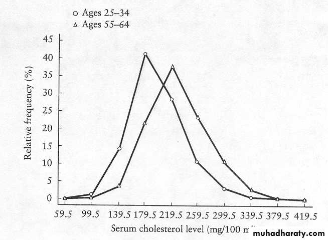
• Frequency polygon: it is similar to histogram in its use for quantitative variable but polygon can be used for 2 or more sets of data & this is an advantage of this polygon in facilitating comparisons. It can be constructed from histogram by taking the midpoint dot of each rectangle (class interval). Especially useful for presenting data from several samples in one diagram

Frequency Polygon

Frequency Polygon
11/7/2021
10Perinatal mortality in the oblasts of Belarus
3.Ogive (Cumulative Frequency Polygon):
An ogive is a plot of the cumulative frequency distribution .The ogive is always an increasing graph which eventually flattens off
The ogive is good for measuring the median and other percetiles
4. Scatter-plot (diagram)
A general form of bivariate plot , showing the joint distribution of two variablesA scatter diagram displays the relationship between two continuous variables
Useful in the early stage of analysis when exploring data and determining is a linear regression analysis is appropriate
May show outliers in data
13
14
15
16
17
Frequency curve
If the class intervals are made smaller and smaller while, at the same time, the total number of items in the data is increased more and more, the points of the frequency polygon will be very close together. The smooth curve joining them is called the “frequency curve”11/7/2021
18
PICTORIAL PRESENTATION OF DATA (Charts):
1.Bar chart: it is used for discrete quantitative variables and qualitative variable. The bars are constructed to show the frequency or relative frequency for each category of the variable on Y-axis, while X-axis is for qualitative & discrete values. It is important that Y axis should start at zero.Bar chart is represented as separated rectangles. Width of bars , the horizontal spaces between bars ,and the ordering of the bars are chosen for convenience
• Only heights of bars are important
• Bar chart can be used for more than 1 set of data.
Actual Causes of Death†
TobaccoPoor Diet/Lack of Exercise
Alcohol
Infectious Agents
Pollutants/Toxins
Firearms
Sexual Behavior
Motor Vehicles
Illicit Drug Use
Causes of Death United States, 2000
Leading Causes of Death*
Percentage (of all deaths)
Heart Disease
Cancer
Chronic Lower Respiratory Disease
Unintentional Injuries
Pneumonia/Influenza
Diabetes
Alzheimer’s Disease
Kidney Disease
Stroke
Percentage (of all deaths)
2. Component bar chart (stacked bar chart): use shaded or colored bars to show the contribution of different components of each variable.11/7/2021
INSY200 Fall-9923
Stacked Bar Chart


Stacked Bar Chart
0%10%
20%
30%
40%
50%
60%
70%
80%
90%
100%
Category 1
Category 2
Category 3
Category 4
Variable 1
Percent
Variable 1 Category 3
Variable 1 Category 2
Variable 1 Category 13.Clustered Bar Chart
In a Clustered Bar Chart, the bars for one variable are grouped according to the values of the others qualitative variables.Example of a Clustered Bar Chart
Sample Clustered Bar Chart0
0.02
0.04
0.06
0.08
0.1
0.12
0.14
0.16
Category 1
Category 2
Category 3
Category 4
Variable 2
tiRelative Frequency
Variable 1 Category 1
Variable 1 Category 2
Variable 1 Category 34.Pie Diagram (chart): it is a circle divided into sectors with areas proportional to the frequencies or the relative frequencies of the categories of the variable. It is used for one set of data.
To represent the data as pie chart we must :
Find the relative frequency distribution of each category (i.e. % of each variable).
Multiply the relative frequency distribution by 360o to find the degree of each category.
Determinants of Health Status
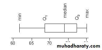
Source: Schroeder SA. N Engl J Med 2007;357:1221-12285. Boxplots (Box and Whisker Diagrams):
• A box plot is a simple graphical summary of continuous quantitative data.• Box plots can quite usefully display the essential features of many samples in one chart.
• It gives a useful idea of the sample distribution( shows prominent features like location, spread, skewness and outliers)
• ·
A box-plot is a visual description of the distribution based on
Minimum
Q1
Median
Q3
Maximum
Useful for comparing large sets of data
11/7/2021
32In the box plot:
The box represents the interquartile range. The line across the box indicates the median.The "whiskers" are lines that extend from the box to the highest and lowest values, excluding outliers.
If the box is closer to the lower whisker, the data are probably skewed towards the lower end of the scale. If the box is closer to the upper whisker, the data are probably skewed towards the higher end of the scale.
If the box is in the middle of the whiskers, the data are probably more evenly distributed
11/7/2021
34Box-plot
35
36

75th percentile
25th percentile
50th percentile / median“Whiskers’ extend to largest
and smallest observed values within 1.5-box lengthsControl
InterventionStudy Status
Outliers are hidden
Extreme values are hidden
Non-User
Useron insulin at enrollment
5.0
7.5
10.0
12.5
15.0
12 Month HbA1c
Box Plots / Box-and-Whisker plot
5.Pictogram: it uses a series of small identifying symbols to present the data, each symbol represent a fixed no. of limits.
6. Map chart: geographical distribution illustrated by symbols over a map.
11/7/2021
37Presentation of data
Benefits of Using TABLESmore accurate than graphs
more concise than graphs
Benefits of Using GRAPHS
provide good general overviewallows reader to visualise the concept
Things to keep in mind when completing the results section of your paper:
1.Any table or graph should include a title that clearly states what is included in the table.2. In any graph , it is essential to clearly label the axes so that the reader knows how to read the data being presented.
3. Don’t include graphs just for the sake of having more graphs. Some projects may not use any graphs, others will use several.
• 4. Tables and graphs should include only information that is relevant for seeing (this is the information the researcher wants to convey).
• 5. If you make adjustment with your data, you should explain it in the text. It is important to document why you may exclude outliers in the text of your paper
• 6. The table shouldn’t include too much information.
• 7. The important thing is that the tables and graphs are clear and easy to the reader .The table should be well organized.